The 411 on Braille Business Cards
Published onPlease note: Braille Works has suspended braille business card production.
Don’t you love that moment when you meet the perfect potential business connection? Braille business cards not only impress blind and visually impaired contacts, but sighted connections as well. It shows you’re conscientious of others’ needs and that equal access for everyone is important to you. This all-inclusive approach makes you more accessible and likely to get a call back.

Related: Braille Defined – What is Braille?
Realities of Braille Business Cards
Your business card is full of important info like your name, email, phone number, address, logo, and any other number of things you feel inspired to add. You want all of that information preserved in Braille, right? Well, it doesn’t quite work that way. But, there’s a good reason.
The information on your card is, most likely, in tiny font so everything fits and is aesthetically pleasing. That’s great! It’s wonderful that we can adjust font sizes to fit the content we want in a limited space. However, good Braille isn’t like that.
Braille is approximately the size of 29pt Arial font
Big, right? If you were confined to 29pt printed font, you wouldn’t have room for much on your business card. That’s the case with Braille.
Don’t fret – it’s ok
It’s really ok that your new connection with blindness or low vision can’t see all of the amazing information on your business card. They don’t need to. All they need is a way to contact you again so you can develop that strong, professional connection your networking efforts obtained.
It’s best that the Braille portion of your business card contain at least 2 of the following:
- Your name
- Your email address
- Your phone number
That’s all you need! Easy peasy.
Bear in mind…

Braille business cards also works best with letter-for-letter substitution – known as Grade 1 Braille. It helps to cut down on potential confusion or misinterpretation of braille characters. Grade 2 – contracted braille – is an option if you’re unable to fit the information you need on your card. This is usually only used if a person’s name or email address is unusually long. Grade 2 braille isn’t a guarantee that the information will fit, but it’s worth a try.
Real world example
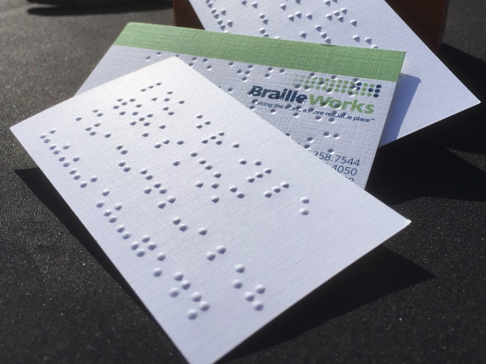
Braille Works’ generic company business card has our contact information. This provides the reader with the information they need to reach us. Here’s the text we emboss on the card:
braille works
info@braille
works.com
800.258.7544
What do you notice?
- “Braille Works” isn’t capitalized – Capital letters add an extra character so they’re often made lowercase to save space. But, it’s ok since the braille reader can understand what they’re reading without the capital letter character.
- Our email address falls on 2 lines – Email addresses often exceed 13 characters so they usually take up 2 or 3 lines. It’s best to break email addresses at logical places to help the end user understand what they’re reading.
- Our phone number has dots instead of dashes and parentheses – Unified English Braille (UEB) adds a new number sign character when numbers are separated by anything other than a dot. And, since there’s a character limit, adding dots makes the phone number exactly 13 characters. (Remember, an extra character is added before “800” to tell the reader they’re reading numbers.)
- We’re not taking full advantage of the available characters per line – This is worth repeating: it’s best to break lines at logical places. It doesn’t make sense to utilize all characters available within a line for the sole purpose of cramming information onto the business card.
Categorized in: Accessibility, Informational
This post was written by
Comments are closed here.