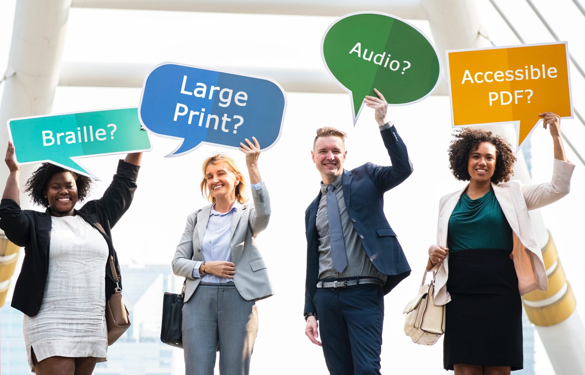
Things To Know Before Making Your Documents Accessible
Published onYou’ve received a customer request for accessible versions of your printed or online materials. You’re excited because you get to showcase how accessible and open your company is. The search begins for an appropriate Document Accessibility Partner that can help fulfill your customer’s needs. You find potential partners, submit a few quote requests, and wait to see who can meet your budget and time frame. But then you find out that making your documents accessible isn’t exactly what you envisioned. Your documents can be made accessible; just not the way you thought.
We’ve learned that accessible documents are a subject that many people don’t fully understand. And, we get it. You’re buried in your own work; focused on your own area of expertise. But, here’s the thing; we live in a society where we need to try to educate ourselves — at least a little — on matters that truly affect other people.
We all have blind spots so let’s shine some light on what accessible documents entail. That way you’ll be better prepared the next time you receive a customer request or, better yet, opt to make accessibility a priority.
Let’s begin.
Large Print
Most people put a lot of time and effort into their print materials. It can be a labor of love. So, when a customer requests large print, many want it to look the same as their original document — just bigger. But, to create a positive, readable experience for someone with a visual impairment, the large print needs to look — for lack of a better term — basic.
Most people with visual impairments need the information displayed in the most visually basic way possible in order to achieve ease of readability. The document should be simple. There shouldn’t be any shading, fancy colors or fonts, and crazy, visually aesthetic but distracting graphics. Large print documents need standard fonts in a large size with black text on a white background. If you really want to “jazz it up,” you can add a dark blue header or a yellow background but that’s really as far as you should go.
Who benefits from Large Print documents? You might be surprised.
Audio

The sound of Text-To-Speech (TTS) audio often surprises people. Many of us of would prefer to hear Morgan Freeman-style narration, but that’s not really “budget-friendly.” TTS audio is a great, viable alternative to Mr. Freeman’s soothing baritone voice. Plus, the reality is that people who regularly listen to TTS audio understand it much better than those of us who don’t. In fact, it’s not unusual for people with visual impairments to play their audio at an accelerated speed because they’re so accustomed to the computerized voice. Our co-founder, Lou Fioritto, has his phone’s audio at such a high speed that many of us in the office can’t understand anything it says.
Human reader audio is also available. However, it’s often more costly and there’s a risk of getting a reader without a non-regional dialect. And, you probably won’t get Morgan Freeman.
Braille
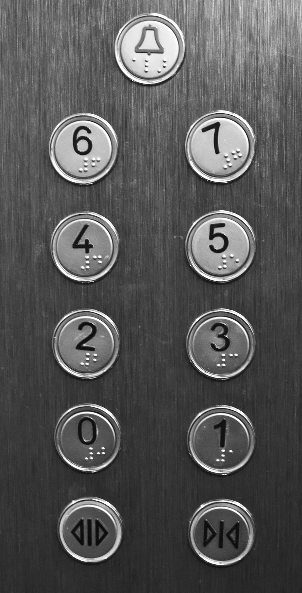 You see it on ATM’s, restroom signs, elevators, and other places throughout your world. The braille always seems to fit nicely in these places, doesn’t it? It’s not too awkward and fits on the appropriate button or nicely under the “Men” and “Women” text on restroom signs. It should fit beautifully on your print materials too, right? Well, not exactly.
Braille is big. I mean, really big. In fact, a lot of people are surprised by how large braille is. Many assume that it takes up the same amount of space as regular text or that it fits nicely in a specific area. But, braille is BIG. In fact, it’s nearly equivalent to Arial 29pt font. That’s why there’s a limit to the number of characters you can fit on a business card or why your 1-page document is now 3 pages of braille.
So why does it fit nicely in the places you’ve seen out and about? Consider the size of the corresponding text you read. It’s usually fairly large. You don’t think about its size in the space it occupies because it fits and looks nice. But, compared to the font in your letter, it’s significantly larger. Also, the companies making ATM’s, common signs, and elevators often order expensive, custom materials to make these products since they’re produced en masse.
Converting your materials to braille is handled differently than a company mass producing signs. It may not fit as you imagined, but your customer will be able to understand the material better and have a more pleasant experience with a properly formatted braille document.
Learn more about Why Quality Braille Documents Matter
Accessible PDF
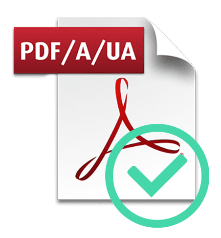
Did you know that making changes to an Accessible PDF after it’s remediated makes it non-compliant? Some of our customers didn’t. They learned the hard way. Once the final, compliant PDF is submitted, any changes – even cropping pages to the desired size – can make a file non-compliant. Then the “Accessible PDF” no longer meets WCAG AA standards and people end up paying to have it remediated again. We do our best to educate customers early in the process but occasionally there are miscommunications and multiple people involved in the project so this detail may fall through the cracks.
There are a few other Accessible PDF misunderstandings that may occur. That’s why it’s best to communicate well with your Document Accessibility Partner. You’ll have a good understanding of what’s needed to make your PDF accessible.
Find out why many of your customers can’t read your documents
Time

Making your documents accessible isn’t as easy as you may think. It takes time to do it right. And, there’s a good chance there are other clients in the queue ahead of you. Let’s be honest; if this process were simple, you’d be able to create your own accessible documents at a “print and ship” place. (Think Kinko’s.)
To do this right — so that your customers are happy with the finished accessible materials — you’re going to need to have an accessibility partner that understands what it takes to create a well-formatted, accessible document that’s easy to navigate and read. But in the end, it’ll be worth the time because you’ll give everyone access to your business.
You’re Ready
Now you have some clear expectations and are better prepared for future interactions with a Document Accessibility Partner.
Bear in mind, it never hurts to ask if they can format your accessible documents the way you want. The worst you’ll hear is “no;” probably accompanied by an explanation of why and how it’s better for your customer if done differently.
The ultimate goal of all of this is to make a good, easily readable product for people with blindness, a visual impairment, or other disability. And, not to brag or anything, but you’d be hard pressed to find a company that’ll do it better than Braille Works.
Categorized in: Informational, Uncategorized
This post was written by
Comments are closed here.