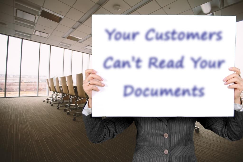
Your Customers Can’t Read Your Documents
Imagine you need to review an important document from your bank, insurance company, or healthcare provider – either printed or online – and you can’t read it. The ink is smudged or the text runs together because of a printing error. Maybe the text is a color that is extremely difficult to read on the chosen background color.
Or, as I’m sure many have experienced, there’s an issue with the website and you can’t access your bank balance, see if your insurance covers something, or pay your medical bill before it hits collections. (Cue the urge to throw things.) What are you supposed to do when the content you need is inaccessible?
The Lost Audience

Millions of people with visual impairments and blindness around the world have to deal with similar, and often frustrating, situations every day. Let’s look at some technical but important data for a moment.
In 2015, the International Agency for the Prevention of Blindness (IAPB) found that an estimated 253 million people globally have blindness or a moderate to severe visual impairment. Out of these 253 million, Nvison states that in the United States alone, 12 million people are over the age of 40, and 1 million are legally blind. That’s a lot of people who can’t read standard text, see low-contrast colors, or access content on a website.
So, what constitutes a visual impairment? I mean, my parents can’t read a menu without their glasses. Are they included with the 253 million people? No, they’re probably not. In these stats, terms like “visually impaired” refer to people who have difficulty seeing even with the aid of glasses and contacts. The people included in the aforementioned numbers have significant visual impairment which means your parents are only included in those statistics if their glasses don’t help them read a menu.
Reduce Frustration
So, how can you reduce frustration and properly reach this audience? Your best solution is to work with a Document Accessibility Partner, like Braille Works. A Document Accessibility Partner will work with you to provide your or your client’s unique content in Large Print, Braille, Audio and Accessible PDF. Other services they may provide include color and format suggestions to help make your content easily readable, too.
Having a Document Accessibility Partner opens up access to this previously missed audience. And advertising your new accessibility efforts shows the public you care about, including everyone.

Reach a Wider Audience
There are a few steps you can take to be more inclusive while researching the best Document Accessibility Partner for your company. We’ve included a few best practices to implement in your regular print designs to make them more readable.
Color
Color choices are crucial to ease of readability – especially for people with visual impairments, dyslexia, and color blindness. Adequate color contrast between the colors you choose is imperative. The Web Content Accessibility Guidelines (WCAG) recommends a minimum contrast ratio of 4.5:1. When choosing colors, it’s often best to pick from opposite sides of the color wheel. It’s also important to avoid using color as the sole means of communicating information. For example, you shouldn’t label required form fields exclusively with a certain color. There needs to be another identifier, such as an asterisk.
Layers
Another important aspect to consider is layering. Layering images or graphics behind text makes the content difficult to read. It’s often best not to layer content at all. If you feel you have to add something behind your text to make it “pop,” add a simple shape with a high-contrast color.
Paper
Paper with a matte finish is best for readability. Glossy paper creates glare and makes it difficult for people with visual impairments to see. With some creative design, you can make a readable, matte-finished marketing piece look better than any glare-inducing, glossy flier. People with visual impairments will enjoy it, too.
Font
The font you choose plays a major role in readability. Complex or decorative fonts can be difficult to decipher. Letters may run together and be unrecognizable to someone with a visual impairment. It’s best to stick with simple, easily recognizable fonts that have clear uppercase and lowercase characters. Arial and Verdana are the most commonly used accessible fonts. They may not have that “flare” you want but more people will be able to read your content.
Go Forth and Create

Now that you know there’s a huge, untapped audience you can include, it’s time to get creative and make exciting, readable, engaging content for them. It’ll be exciting to watch your metrics grow as you learn to tailor your message and your design to include this audience. We can’t wait to see what you create.
Related
- New to Accessibility? Start Here.
- The Need For Document Accessibility Is On The Rise
- Don’t Lose Readers Because of Poor Website Accessibility
- Are Digital Marketing Agencies and Communication Managers Key Players in Accessibility?